

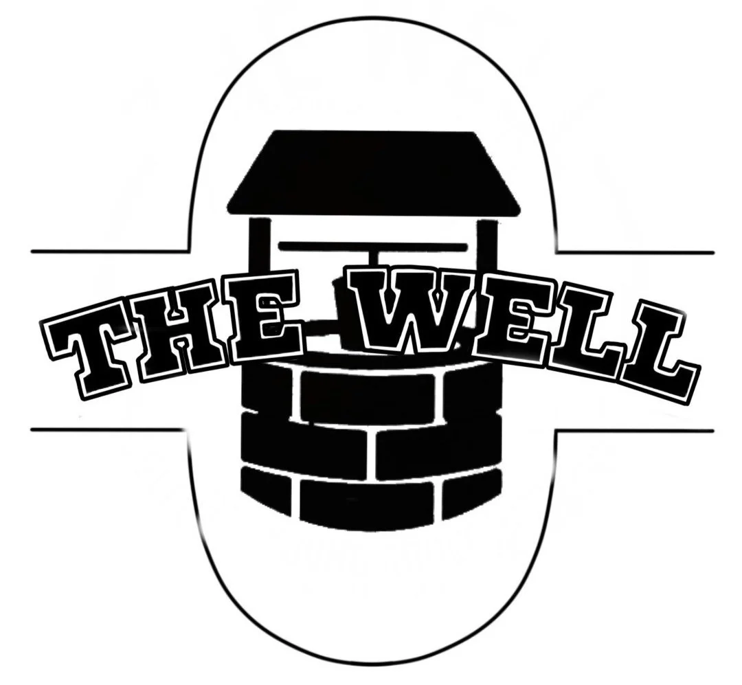
The Well is the Young Adult and College Ministry of Grace Fellowship Church.
I was commissioned to make a fresh design for their merchandise that incorporated their logo and mimicked classic collegiate apparel.
Design Research
The Well gets its name from its Biblical Significance:
Meeting Place (Genesis 26:17-18, 29:2-3, Exodus 2:15-17)
Source of Living Water(John 4:13-14, 7:37-38)
Overflow of Salvation and Blessing (Isaiah 12:3
Olive Branches (used in final design) appear around “The Well” because they are also a significant Biblical Symbol:
God’s Kept Promises to His people (Genesis 8:11)
Grafting into His Kingdom and Family (Romans 11:17-18,24)
Dependence on God (John 15:4-5)
Spiritual Growth (Psalm 1:3, John 15:2)
Righteous standing before God because of His faithfulness (Psalm 52:8, Isaiah 4:2)
Fruitful Promised Land (Deuteronomy 8:7-8)
Israelites’ Desire for a King, later fulfilled in Jesus (Judges 9:8-9)
First Drafts
1


2

3

4
I worked with the Creative & Administrative Assistant and the Youth & Young Adult Pastor to understand the ministry’s needs. They liked Design 2 and Design 3. They asked that the final include the layout of Design 2 with the typography of Design 3 as well as the ministry slogan (“It’s a Wednesday Thing”) and established year (“2018”).
Final Design


White inline of “The Well” has uneven spacing to mimic a worn college sweatshirt.
A serif typeface was used for the slogan and established year to increase collegiate undertones.


Christ Community Chapel’s Paint War is an annual event held by their High School Ministry … and it’s messy.
High School students gather to throw paint at one another to kick off the new school year. They needed a fun t-shirt design that High School Students would want to wear (white and tie-dyed with paint).
I was commissioned to make designs for the 2022-2023 Paint Wars.


First Drafts


Final Designs
All elements (including typography) were hand-drawn for an increased artistic feel.


Grace Student Night is the Middle and High School Ministry of Grace Fellowship Church.
I was commissioned to make a design with smiley faces that they could use for merchandise and advertising.
First Drafts
I worked with the Creative & Administrative Assistant and the Youth & Young Adult Pastor to understand the ministry’s needs. They asked me to make a design incorporating the ministry slogan (“We believe in the Youth”) and smiley faces.
1

2

3

The staff liked Design 2. Revisions for the final needed to include:
The Church logo - but “wiggly” to fit seamlessly within the design.
Color - a monochrome version for shirt printing and a multicolored version for stickers and promotions.


Final Design
The logo in the monochrome design is black, so it does not get lost among the smiley faces.
Monochrome

Multicolored

Sticker


Chosen Vessel is a Contemporary Christian Band based in Youngstown, Ohio.
I was commissioned to make a design for their band incorporating their verse and a trendy image.
Design Research
Chosen Vessel gets its name from Acts 9:15, which says:
“But the Lord said to him, ‘Go, for he is a chosen vessel of Mine to bear My name before Gentiles, kings, and the children of Israel. For I will show him how many things he must suffer for My name’s sake.‘”
The band wanted the design to include an image of a vessel and the verse reference. The book of Acts was written 80 A.D - 90 A.D.
This “vessel” I drew is a combination of pottery made in this era.


First Drafts


The band liked the repeated verse behind the vessel of Design 4 with the curved text and typeface of Design 1.
Typeface Choices: Trocchi for Body Copy (designed for text and display) and Catchy Mager for Title (designed for logos needing unique styles and an elegant shape).
Final Design
Back Design

Pocket Design

Sleeve Design

