
Truth Builders
Truth Builders is a new Kids’ Ministry Program of Old North Church with the mission of helping kids memorize scripture.
Their goal is to “lay a strong foundation of God’s Word in children’s lives. Each week, kids will experience a fun, engaging, and age-appropriate program that helps them grow in their faith, understand biblical truth, and develop a lifelong relationship with Jesus.”
I was commissioned to make a logo for this new program that would be used for merchandise (i.e. notebooks, stickers, etc.), marketing, t-shirts, and more.
Design Research
The name “Truth Builders” comes from the church’s premise that you cannot force children to believe in Jesus, but you can build a foundation by teaching the Bible, so when they are ready to believe, a solid groundwork is set.
Truth Builders is meant to help children realize they are part of the local church, not a separate entity within the church.
The Program was designed to establish the philosophy of studying scripture in children ages four - fourth grade. It moves away from difficult, reward-based systems of the past and emphasizes repetition.
Logo Requirements
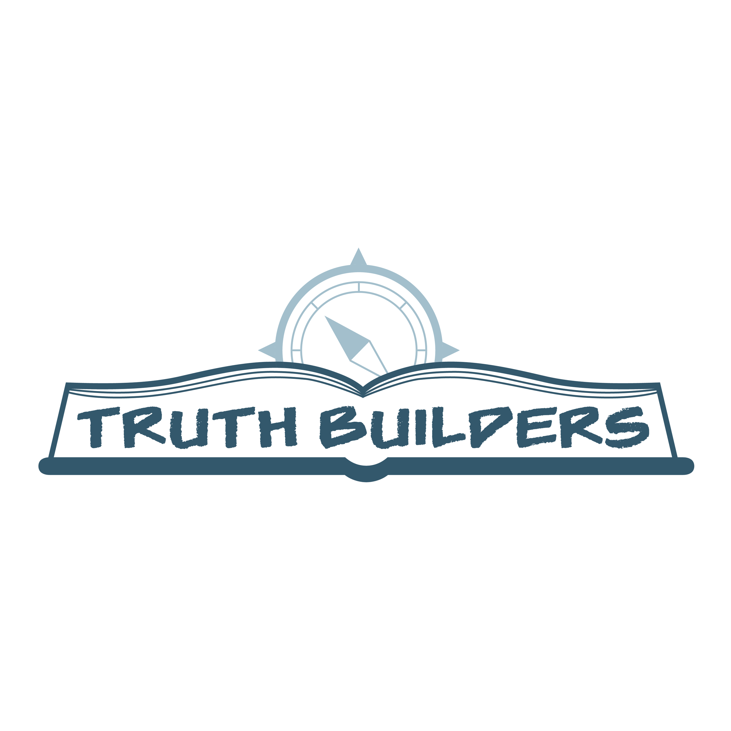
The compass from the church logo
The gray and/or navy blue paint colors used in the Kids Ministry
A book to communicate the truth is built on Scripture


Sketches and Ideation


First Drafts


The staff preferred designs 5 and 6 but requested the following changes:
All of the Bible outlined in navy;
The binding of the Bible filled in, instead of an outline;
The compass smaller and lighter;
The Bible and “Truth Builders” be larger;
The font changed to FLUNKIES BB, which is the font of all ONC family ministries so the logo will identify with other Kids’ Ministry Programings.

1
2
3
4
5
6
7
8


Revisions


Final
Rounded edges of the book cover communicate a seamless and playful look;
Navy Blue is used to match the paint color and overall branding of the children’s wing;
The Old North Compass is centrally located to convey that kids are a part of the local church;
FLUNKIES BB is the main typeface (since it is the typeface used in all Family Ministry programs), so the logo is easily identifiable as a family-centered ministry;
Elements of repetition and symmetry are included to communicate the repetition used to help kids memorize Bible Verses.
