Symphonic 70s
*
Symphonic 70s *
In January 2024, a Las Vegas Orchestra performance toured in various cities. I was commissioned to make an eye-catching poster advertising the Warren, Ohio concert to students in local high schools.
On this project, I worked closely with the conductor starting in late 2023 to ensure the poster visuals and concert information were properly communicated.
Concert Information

Design Research
The conductor asked that I make a poster inspired by Woodstock, Surrealism, and Psychedelic Art Movements.
These art styles are marked by:
Vibrant and Contrasting Color Combinations
Custom Display Typography
“Groovy” Patterns
Extreme Design Risk Taking
Printmaking (often rough and rugged designs)
The poster would be hung in local high schools to advertise discounted tickets for arts and music students, so it needed to be eye-catching to engage them.
First Drafts


Second Drafts

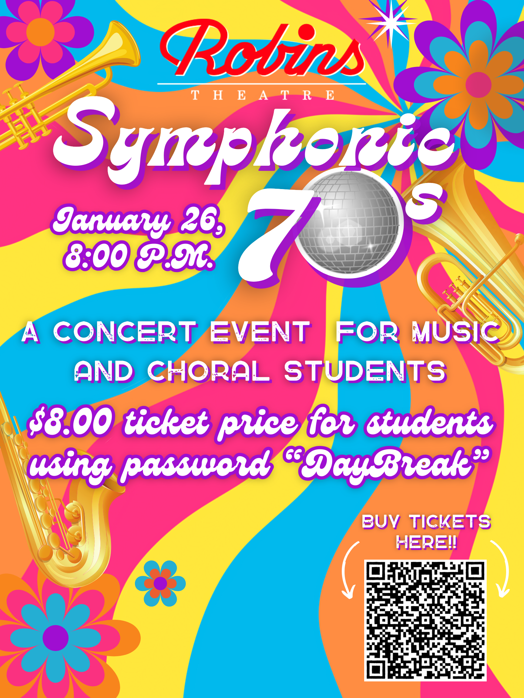
The conductor thought the Disco Ball 0 in the 70s better communicated aspects of the event and fit with the other musicians’ advertisements for the tour.
The white glow behind the host logo “Robin’s Theatre” and the drop shadow behind the disco ball made both aspects stand out against the vibrant background.
He preferred the hand-drawn background and the muted instruments over the detailed, shinier ones, not to distract from the typography.
Final Design
The Title Font (Laries Script) was designed to appear simultaneously retro and modern - the exact idea of the Orchestral Performance (bringing back 70s music).
The Heading Font (Genty) was designed to be bold, perfect for a standout typeface.
I used a rough font for body copy (Greenth Grunge), as many posters from the 70s utilized printing presses, and posters appeared “rugged.”


The conductor thought the use of brass instruments better advertised the orchestra.
He preferred the direction of Design 1 but asked me to create a groovy background for the poster.
The final also needed to include bright colors to speak specifically to the youth audience.
I drew these two “groovy” patterns incorporating highly-saturated color combinations commonly used in the 70s.
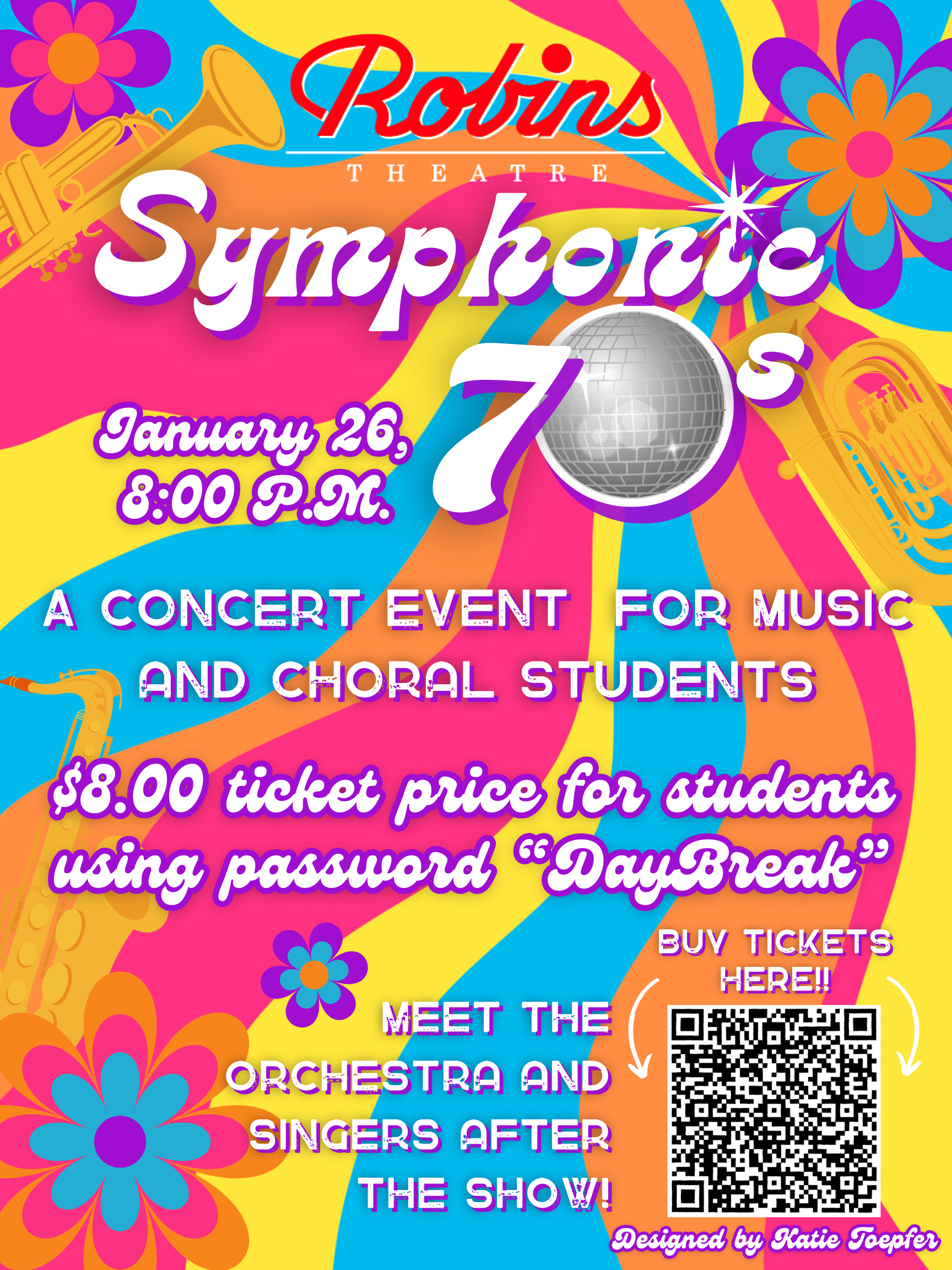
The conductor thought both backgrounds would be effective but wanted to see them in use.
The next round of iterations includes posters with both backgrounds, in addition to a few others I discovered during the ideation process.